
You surely have seen the apple logo hundreds of times, but have you ever thought about why it has a bite and why not a whole apple?

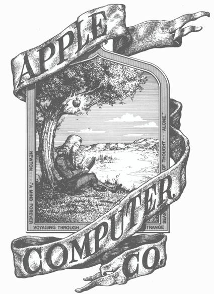
This all started when Steve Jobs wanted to change this logo for something simpler as he thought the previous logo was quite complicated to understand and was difficult to print on a small scale like the back of the iPhone. The first hand-drawn logo of apple looked something like this:
 |
| First Apple Logo |
After a while, Steve Jobs hired Rob Janoff for designing the new logo. Though Steve Jobs wanted to change the logo he gave complete freedom to Rob Janoff and only gave one direction to him, to not make the logo cute.
 |
| Rob Janoff |
|
| Apple Logo without the bite |
He started off by making an apple without a bite. That logo looked good to him but there was a problem, it could be very easily mistaken for a cherry or a tomato. After thinking of a white he finally took a bite from that apple and that solved the problem.
Then he added stripes of color to symbolize the ability of Macintosh to reproduce colors. He then showed the logo to Steve Jobs and Steve Jobs replied with "Okay, That’s Nice" and it became the official logo of Apple Inc. from that day onward.
| Final Logo made by Rob |
Though there are many more rumors and stories made. This is the original story behind the bite on the apple logo as confirmed by the logo designer Rob Janoff.